Mercedes-Benz
Mercedes-Benz
A REDESIGN FOR ONE OF THE WORLD’S MOST VALUABLE BRANDS.
MBUSA.com is a central destination for customers – where they engage with the brand, research products and take meaningful steps towards ownership. The redesign of MBUSA.com was the most significant change to the site in more than 7 years. When a wholesale redesign became necessary, we made sure that our design approach was informed by rigid user testing and data analysis.
Project: Website redesign for Mercedes-Benz passenger cars, US and Canada
Role: VP, Senior Creative Group Director, Experience
Activities and Deliverables: My overall responsibilities on the account include overseeing the UX/UI for the Mercedes-Benz US and Canada digital platforms including Mercedes-Benz Financial Services and Sprinter Vans, responding to the needs of our clients for any given week, and leading a team of UX directors and designers. Due to the high priority of this particular assignment, I became actively involved in the day-to-day design process. This included attending daily design reviews, facilitating workshops with clients, organizing user testing, scrutinizing the data with my Data Science colleagues, and running sketching sessions.
The global navigation prior to redesign.
Our Challenge
While redesign and redevelopment - versus incremental optimization - carry a high degree of risk due to years of familiarity with site visitors and millions of visitors, a redesign was deemed necessary for the following reasons:
The look and feel was outdated and did not reflect a premium luxury brand.
The previous design had reached the limit for incremental enhancements.
We needed for a scalable solution for expanding model lineup.
The new design needed to provide a foundation for e-commerce.
Our approach needed to be mobile-first, responsive, and accessible (ADA AA Compliant).
The site needed to be optimized for speed performance for both mobile and desktop
User Testing and Participatory Design
In order to refine the designs, we conducted four usability test sessions with 16 total participants throughout the design process.
Age ranges 25-75 years old
Luxury vehicle owners
4 locations: Los Angeles, Miami, Atlanta, New York
Short introduction and brief qualitative review – vehicle shopping and digital platform preferences
Participants were asked to interact with the navigation, and designs were tested iteratively
Asked to search for various tools and content on both mobile and desktop
In addition post-launch user testing was conducted versus the UK website (in addition to homepage, class/model pages, BYO and Inventory/Find a Dealer)
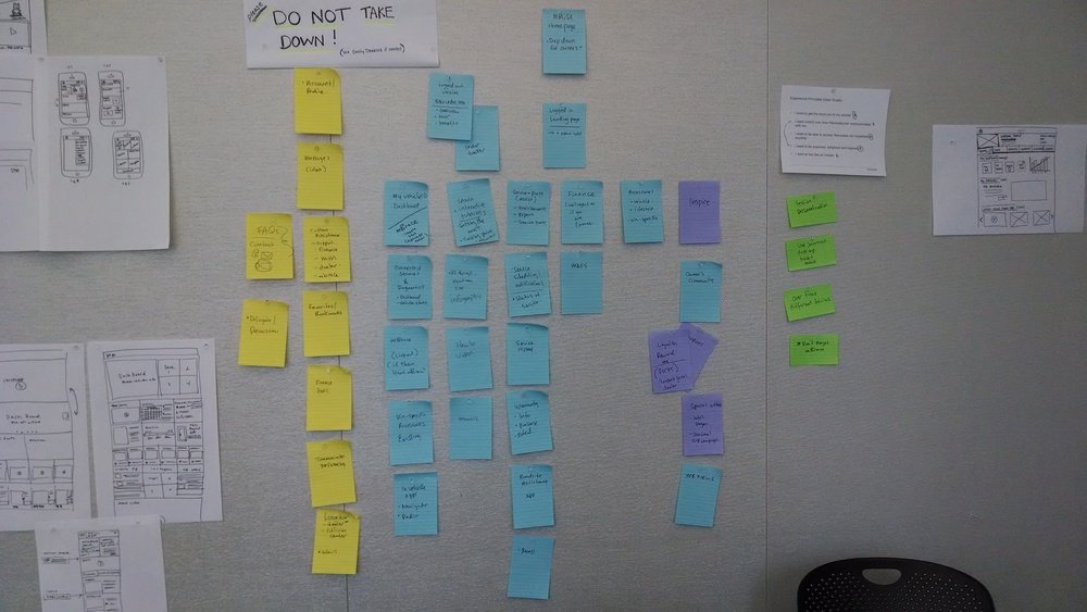
Sketching and information architecture workshop.
Final Design - Homepage
Monitoring the Data
In addition to multiple rounds of user testing we carefully monitored performance of the new designs. Since so many changes were made to the information architecture and contents of the site, some areas key destinations within the site saw increased traffic while there were declines in other areas. Over a period of 3 months, the user experience team worked along side the data sciences team to find the issues and optimize the site experience.
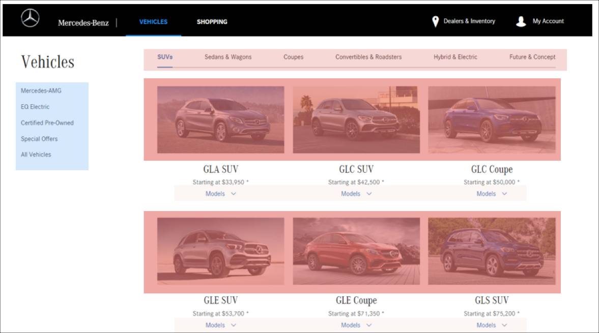
Heatmap used to show user engagement. This helped to inform optimization recommendations.
The Impact
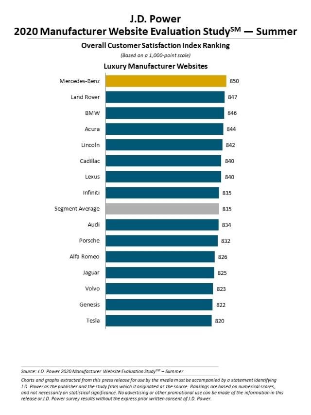
As a result of our efforts and in addition to achieving all time high record leads and visits to the site, MBUSA.com achieved the number one ranking in J.D. Powers’ Manufacturer’s Website Evaluation Study in 2020 in both the luxury and mass market categories for the first time in the brand’s history.
Postscript
When possible I like to own and use the products of brands that I work for. However, Mercedes-Benz vehicles are outside of my price range. The next best thing: sponsored by Razorfish’s tuition reimbursement program, my creative colleague and I went to AMG Driving Academy at the famous La Guna Seca Raceway in California where we drove several laps in more than a dozen AMG high performance vehicles. This was the AMG GT-R Roadster. Learn more about AMG Driving Academy here.
Mercedes me
Mercedes me owners app
THE ULTIMATE RESOURCE FOR OWNERS.
Several years in the making, the Mercedes me app was an initiative proposed by our team and ultimately brought Mercedes-Benz into the era of the connected car. Whether using the iPhone or Android apps, the Apple Watch app, or a dedicated owner’s site on MBUSA.com, drivers can do everything from start their car to pay their bill to plan their next adventure. We were also successful in using Mercedes me as powerful source of revenue for the brand. The current app rating is 4.8 on iOS, 4.5 on Android.
Project: Mercedes me owners app and Apple Smart Watch
Role: VP, Senior Group Creative Director, Experience
Activities and Deliverables: For the first iteration of the app and desktop experience, I was hands-on in creating the information architecture for the app, as well as sketching out the flows and UI as I had only one UX designer working with me at the time on this particular track of work. The process for bringing this project to life involved numerous workshops with our US and German clients. I worked closely with the technology team as we iterated toward the final product, and I was also active in advocating for the creation of an Apple Watch version of the app.
OUR CHALLENGE
How do we bring drivers closer to their vehicle, and provide access to features and services they’ve come to expect while also bringing new revenue generating opportunities to Mercedes-Benz?
Vehicle Telematics: Insights into an Owner’s Driving Behavior
Mercedes me gives drivers access to vehicle telematics and real-time data including mileage, fuel level, and trip tracking, with advanced geofencing helping to deliver reports on aggregated driving behavior.
Synthesizing Data from Multiple sources to Increase Engagement and Customer Satisfaction.
Cross-platform analytics data from multiple websites and apps, combined with offline behavior, provide a continuous stream of personalized, targeted content on the platform. Performance data then drives further enhancements and updates. This resulted in increased engagement, greater satisfaction, and higher revenue. We also connected to the business’s Loyalty Accelerator Program (LAP) to push new vehicle incentives to drivers based on how they interacted with their vehicle and the brand overall.
Enabling Customers to Manage the Financing of their Vehicle.
Through integration with Mercedes-Benz Financial Services, customers can now manage their finances simply and securely. Key use cases include making payments to managing accounts, setting up autopay, and requesting a payoff quote.
Schedule Service Right from the App.
Mercedes me allows customers to schedule service at the dealership.
Revenue Generation for the Business.
Having established Mercedes me as an indispensable tool for drivers, we then figured out relevant, non-intrusive ways to generate revenue for the business. Further integration with After Sales and Lifestyle Accessories enabled us to tap into unrealized revenue opportunities through Prepaid Maintenance, Extended Limited Warranties, and personalized gift recommendations.
Further integration with After Sales and Lifestyle Accessories enabled us to tap into unrealized revenue opportunities through Prepaid Maintenance, Extended Limited Warranties, and personalized gift recommendations. We were also able to offer VIN-specific service offers and eCommerce functionality to get drivers into their next vehicle.
UX/UI: wireframes showing the customer flow from home screen to scheduling service.
Apple Watch
The widespread adoption of Apple Watch provided an obvious platform for extending the features of Mercedes me. Our app allows vehicle owners to remote start their vehicle, view their parking location, lock and unlock their car, and check their fuel level. These conveniences were all streamlined and elegantly designed to be readily available within the limited space provided by the watch. The Watch app holds a 4.8 rating in the App Store.
Final designs for the Mercedes me Apple Watch app.
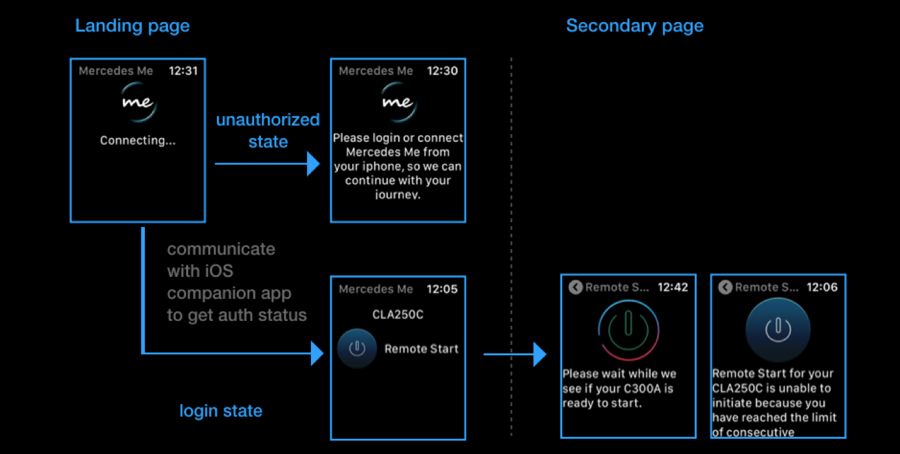
User flow showing the remote start feature.
SPRINTER
Sprinter
Designed for the Business Customer in Mind.
Just as Mercedes-Benz is a symbol for excellence in the passenger car segment, its vans are considered to be the standard for business customers. Mercedes-Benz entered the commercial vans segment in 2001 with the Sprinter, Metris and Freightliner brands. Mercedes-Benz captured 7% market share in a market dominated by Ford (50%), Chevy (24%), and Nissan (9%). Vans is one of the fastest growing divisions at Daimler by revenue, volume and profit.
We pitched and won the business in December 2015, and our digital program offered everything from site development to social media to custom upfit tools and fleet management systems.
Project: Website redesign for Mercedes-Benz vans, US and Canada
Role: VP, Senior Creative Group Director, Experience
Agency: Razorfish
Activities and Deliverables: I was active in the original pitch efforts which included the creation of a strategy and experience that best met the needs of the customers and our Mercedes-Benz clients. Since we won the business, I have maintained an oversight role ensuring that we held to our original experience principles and vision. Periodically I have been hands-on with future vision workshops, helping to identify untapped opportunities for growth of the business and enhanced experiences for our customers.
Pitch concept: helping business customers find the right Sprinter for their trade.
Our Challenge
How do we create a best-in-class Build Your Own experience that drives customers to dealers? Also, how can we create a tool that enables users to compare total cost of operation of Mercedes-Benz Vans to direct competitors’ vans to ultimately drive customers to dealers?
Our Objectives
Redesign the experience to reduce the number of steps and provide clear guidance through an overwhelming number of options, all while providing transparency to monthly pricing throughout the process. Also, the new site provided a comparison tool for users to see how cost-efficient MB Vans are throughout the life of the vehicle, despite the higher upfront cost.
Pitch concept including Build Your Own Upfitting options.
What We Delivered
In addition to marketing and educating, the MBVans.com site includes an array of tools we built for the business customer, including eCommerce capabilities. Our Build Your Own and Upfitter tools work seamlessly together to enable the business customer to select, configure, and equip a van to match their business needs. The experience was optimized for mobile, and included educational content, vocation-based filters, and a 360-degree view of upfit interiors. The site also included an industry-best Inventory search feature and a Total Cost of Ownership calculator to demonstrate the value of Mercedes-Benz Vans over time.
Our site also welcomed and assisted Fleet customers, with dedicated content, special offers, and, most recently, the ability for Fleet customers to configure and purchase multiple vans online. In addition, our marketing efforts on the homepage for the launch of the new Sprinter van saw massive engagement.
Final Design - Homepage
Final Design - Total Cost of Ownership
Final Design - Vans Upfitting
Insights
About 48% of all shoppers start a build
22% improvement in Build Your Own completion rate, with those visitors completing a build being more likely to become a lead and/or estimate a payment
6K TCO visits per month with 48% engagement rate on the page
Users that use TCO are 5x more likely to complete a lead form than the average user
smart
smart
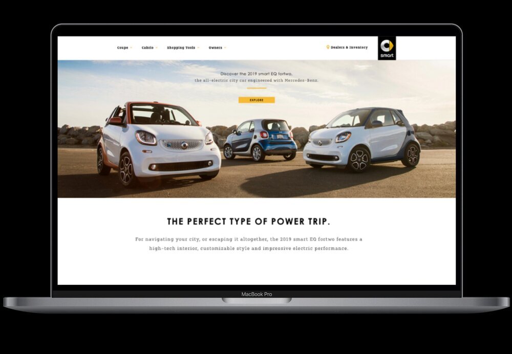
Small car. Small budget. A great brand to test new ideas.
The name Smart derives from the cooperation of the Swiss company Swatch with Mercedes-Benz: "Swatch Mercedes ART". A sub-brand in the Mercedes-Benz portfolio, smart occupies a unique position in the marketplace. They have a very niche market, and they’re currently transitioning to an all-electric offering, but the mission remains the same: create a brand that is fresh, fun, and more relevant than ever. The Smart brand ceased operations in the U.S.in 2019.
Project: smartUSA platform redesign
Role: Group Experience Director
Agency: Razorfish
Activities and Deliverables: I was responsible for leading a small UX team through the re-platforming and redesign of the smartUSA website. This involved ideation workshops and sketching sessions with our client, competitive audits, reviewing wireframes and designs, and creation of the features matrix.
Competitive Audit
We started the smartUSA platform redesign process with a competitive audit. Key themes emerged:
Personalization – Does the site provide a personalized experience (whether it’s site, or recommendations, messaging) for shoppers / owners
Delight – Is there any element of delight for the brand – such as cool interactions, story flow, that makes people view the brand as more than just a product
Safety / Eco / Pragmatism – How does the brand depicts its safety features / fuel efficiency features for relevant models
Cross-Channel Hub – are the layouts between sites consistent / consistent campaign layout / how does the site integrate social channels
Devices – responsive / not responsive / more than responsive?
Inventory / Sales – is there a holistic experience between research / sales tool / Is it easy for the customers to use / is it ‘different’ compared to others
Ownership – how does each brand handle its owners – is there personalized services / features for the owners to enhance the owner experience and retain loyalty
Inventory and Sales
Detailed Wireframes showing how a customer can search and save inventory then find a dealer.
Visual Design for Inventory
Bringing Delight to the Shopping Experience
Site prior to redesign build Your Own Features were limited.
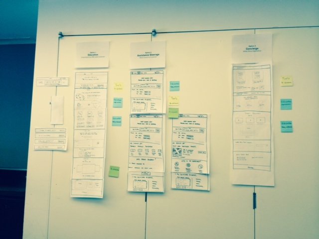
UX sketching session.
Final Design of the Vehicle Page with an state-of-the art embedded 360 immersive configurator.
Sitemap for the Platform Redesign
smartUSA platform redesign sitemap.
smartUSA was a great brand to work with. Unfortunately the Smart brand ceased operations in the U.S.in 2019, however there is still a site that we built to support owners.
MOTOROLA COMMERCE
smart
Working with Google to Reboot Motorola. And a New Android Phone, the Moto X.
In the summer of 2011, Google announced that it would buy Motorola Mobility for $12.5 billion. What they would do with it was an open question, but we soon had the privilege to find out out. After competing with several of the top digital agencies, we were awarded the business.
In addition to a full brand reboot and a wholesale redesign of their digital commerce site, we were tasked by Google to create MotoMaker, a web-based application that enabled unique customization options, with the phone assembled to order at a facility in Fort Worth, Texas. Customers could share their designs on social media and in a design gallery on Motorola.com. Google gave everyone on the team their own custom phones. I have owned several Android phones over the years, and the Moto X has been the best one by far.
Project: Motorola e-Commerce
Role: Experience Director
Agency: Digitas
Activities and Deliverables: I was responsible for the creation of an experience vision in response to the initial client request for proposal. As our clients at Google made the decision to have two agencies devise solutions in parallel, I worked regularly with them to review work prior to final agency selection. I worked collaboratively with the team to create a vision and working prototype. After being awarded the business, I worked with a small team of two UX designers to deliver an e-Commerce platform redesign as well as the creation of the Moto X configurator, which was at that point the most challenging assignment of my career. We held regular working sessions with Google and Motorola, and I collaborated closely with my visual design, copywriter, and engineering colleagues. I also collaborated with Google to plan and run numerous user tests, including dogfooding and biometrics testing.
Our Mission was Straight Forward.
Reboot the Motorola brand
Deliver the Moto X - the proof
Motorola.com prior to our redesign.
Our challenge was to tell a new story for the reboot of the brand.
The Ikea Effect
“Imagine that... you built a table. Maybe it came out a little bit crooked. Probably your wife or your neighbor would see it for what it is, you know? A shoddy piece of workmanship. But to you that table might seem really great, because you’re the one who created it. It’s the fruit of your labor. And that is really the idea behind the Ikea Effect.”
Inspired by the Ikea effect, here is what we did.
UX/UI Deliverables
Final Designs
A completely new brand, and a completely new way to shop for phones.
And not just phones, but accessories as well.
But the center piece was the Motomaker, which allowed customers to custom configure their new Moto X.
Creating a fully responsive version of Motomaker was a challenge, but we came up with an elegant solution that was well-received by customers, and with the press.
Accolades
“Easily the most impressive part of the Moto X package though is how users can customize it using Motorola’s MotoMaker web app. ”
“The Moto Maker tool itself is beautifully designed and incredibly simple.”
“The Moto X with Moto Maker is a cool step forward in phone customization, and I think people will have a lot of fun with it.”
UNIQLO
UNIQLO e-Commerce and In-store Experience.
Launching UNIQLO’s First e-Commerce Site in the US
With more than 30,000 employees and $9.66B in sales, UNIQLO is Japan's leading clothing retail chain in both sales and profits. The brand is well-known and beloved in many countries worldwide, but has struggled to replicate this dominance in the US market. In the midst of this low awareness, we were hired in the spring of 2012 to launch UNIQLO.com, the brand’s first stateside commerce storefront. Competing against several of the top digital agencies, we pitched and were awarded the business. Since working on this project, I remain a die-hard UNIQLO fan and continue to buy their clothing.
Client: UNIQLO
Role: Experience Director
Agency: Razorfish + Digitas
Activities and Deliverables: I helped to win the business with a UX/UI approach and strategy for implementing personalization that best met the needs of our stakeholders. Lead a small team of two UX designers and collaborated daily with visual designers, copywriters, engineers, and our clients. Hands on with wireframes, site maps, and task flow diagrams. Primarily responsible for designing the e-Commerce experience which had an aggressive launch timeline of less than 6 months, but also supported the marketing team due to the complexity of their campaigns — which were cross-platform and involved emerging tech (at one point a QR code on a blimp was proposed). I provided UX designs to a partner agency to create the Magic Mirror experience which was showcased in UNIQLO’s San Francisco flagship store. I also worked daily with NTT in Japan, which was providing the backend infrastructure for the e-Commerce platform.
Our Challenge
We were asked to deliver a digital flagship experience that immersed shoppers in the brand’s famous blend of utility and fun, while positioning the site to achieve sales goals of $20MM within two years. And we needed to do this in under 6 months. In addition to creating a new e-commerce platform, we were asked to support UNIQLO’s marketing efforts, and provide UX support for in-store experience.
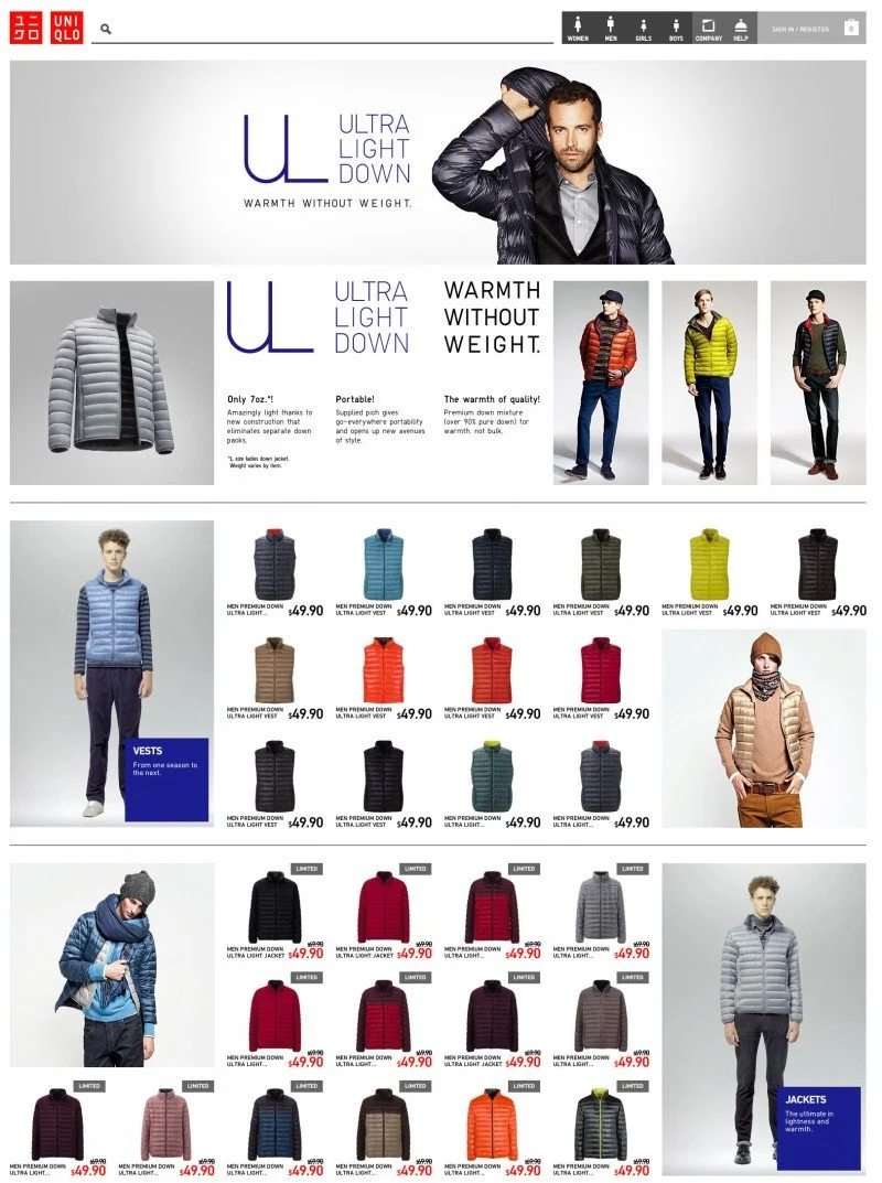
E-commerce Platform
Accolades from UNIQLO Fans
Campaigns
I rarely get called in to work on campaigns. However, the complexity of the marketing campaigns that we were envisioning required hands on UX strategy and the creation of flows that showed the customer journey from social media, to the site and live events. This was the case with our Lucky Cube campaign which featured Maru, a celebrity cat from Japan.
UNIQLO Magic Mirror
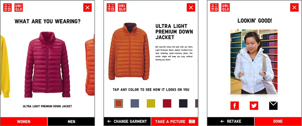
For the UNIQLO store at Union Square in San Francisco, we helped to create the Magic Mirror in partnership with Holition in the UK. The Magic Mirror is a virtual dressing room which helps shoppers decide which item to buy. Using the Kinect’s color-changing engine, customers can put one of the items on and walk in front of the mirror and a touchscreen then prompts them to select other hues and projects the modified reflection back to them. They can also capture images and share them on their preferred social network.
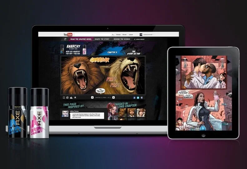
Anarchy: the graphic novel
Anarchy: the Graphic Novel
The First Graphic Novel Made for Social Media.
We conceived the first AXE campaign that not only engaged its consumers, but was created with them. We also embraced a genre that has fueled fantasies for decades, and then reinvented it for a generation raised on the real-time Web.
Over the course of four months, Anarchy: The Graphic Novel was shaped by the suggestions and votes of consumers. Along the way, more than 50 consumers were illustrated into the novel.
Agency: Razorfish
Client: AXE/Unilever
Role: Experience Lead
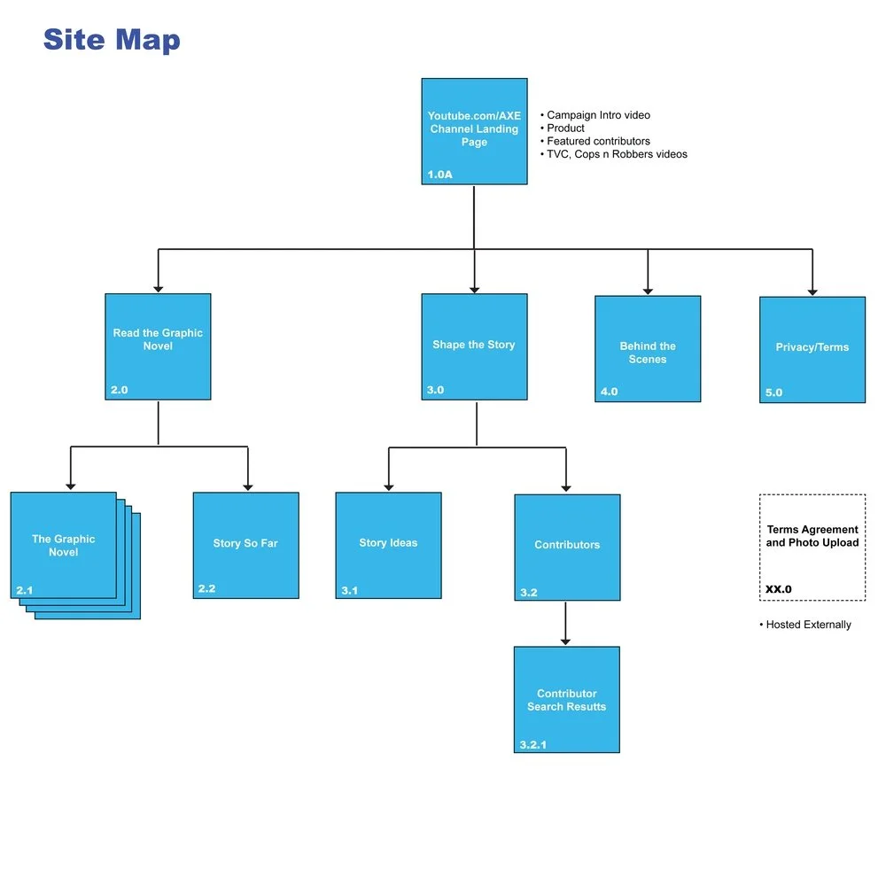
Activities and Deliverables: I was the sole UX practitioner on the project. Despite all the work involved, I did not mind it as it was my dream to work on a graphic novel project. And this particular one was ground breaking due to its use of social and user generated content. Created sitemaps, wireframes, task flows and a features matrix and worked with YouTube to create a custom channel on their platform that would support the graphic novel. I also created ecosystem diagrams that illustrated how Axe’s various social platforms would work together to provide a cohesive experience.
The Impact
Anarchy has become the best selling body spray in the United States
Since launch, AXE has achieved a 10% increase in market share
7 million+ Trailer Video Views
1.2 million+ Visits
50,000+ Votes
15,000+ Suggestions
Awards
One Show Entertainment Gold.
IAB MIXX Awards Gold. Best Product Launch
IAB MIXX Awards Gold. Best Branded Content
IAB MIXX Awards Silver. Mobile Marketing
WOMMY Awards Gold. Best Product Innovation
Cannes Lions Shortlist. Cyber. Cosmetic, Beauty, Toiletries
Cannes Lions Shortlist. Promo Activation
“The Anarchy Graphic Novel is already the already AXE’s biggest campaign ever in the US, with over 12MM consumer interactions to date versus a target of 6MM.”


